Install plotly (install.packages("plotly")) and have a look at the documentation
Install colorBlindness (install.packages("colorBlindness")) and read this vignette
Generate a quarto document named “module-2.2.qmd” in your “modules” project folder so that you can code along with me
In your quarto document, run these code chunks and familiarize yourself the data frames that they generate
Note the use of drop_na() from the tidyr package in constructing the flfp_gdp data frame. drop_na() is a convenient function for dropping rows with missing values.
## Time series data on regional trends in FLFP for line chartflfp_ts<-wb_data("SL.TLF.CACT.FE.ZS", country ="regions_only", start_date =1990, end_date =2022)|>rename( region =country, year =date, flfp =SL.TLF.CACT.FE.ZS)|>select(region, iso3c, year, flfp)glimpse(flfp_ts)
In this module we are going to take our visualizations from Module 2.1 and improve them. In the first part of the lesson we are going to focused on how to make your visualizations accessible to a color-blind audience. Then we will discuss how to improve the look of your visualizations with themes and to provide additional information and context with annotations. Finally, we will spend some time talking about how to make your graphs interactive so that users can explore them in a more dynamic and flexible way.
Color schemes
There are a number of different types of color blindness, but the most common type is red-green color blindness. Making your visualizations colorblind-accessible can be important for convincing certain audiences. Most notably, approximately 8% of men are affected by color blindness.
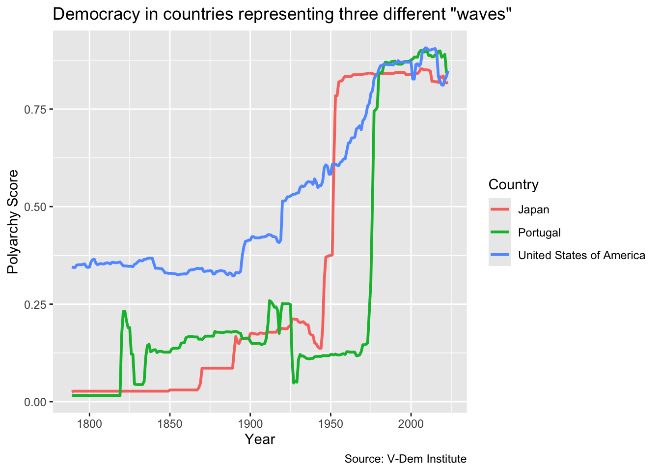
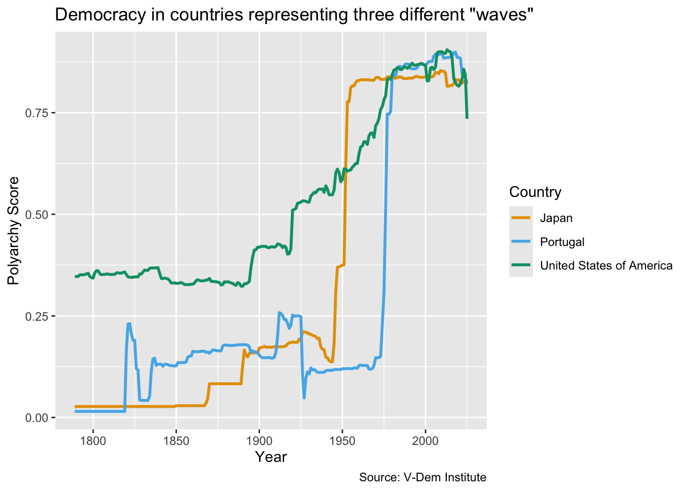
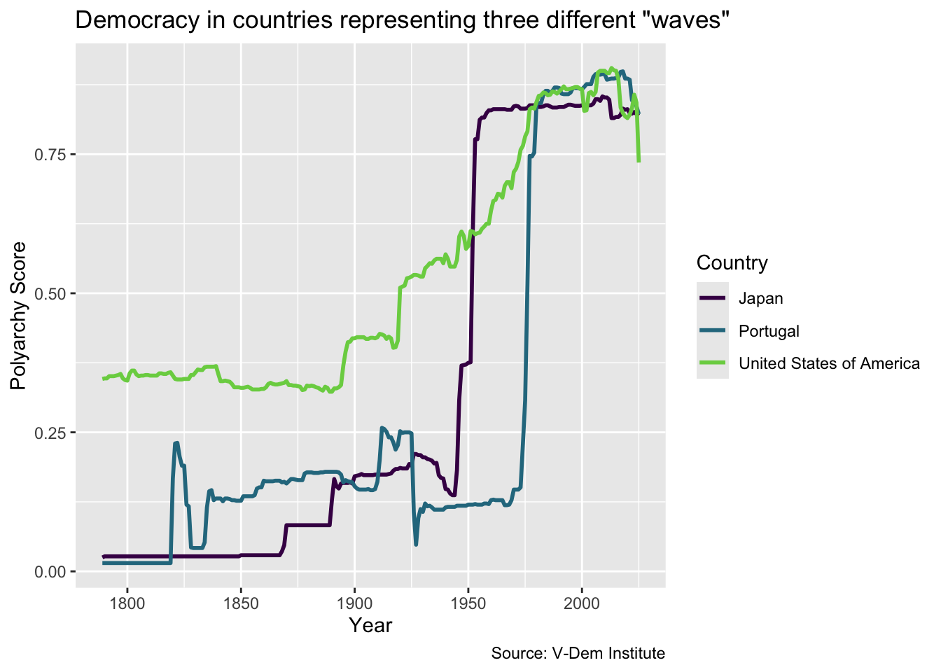
Let’s start off by looking at the line chart that we did in the last module pertaining to Huntington’s three waves of democratization:
dem_waves_ctrs<-read_csv("data/dem_waves_ctrs.csv")dem_waves_chart<-ggplot(dem_waves_ctrs, aes(x =year, y =polyarchy, color =country))+geom_line(linewidth =1)+labs( x ="Year", y ="Polyarchy Score", title ='Democracy in countries representing three different "waves"', caption ="Source: V-Dem Institute", color ="Country")dem_waves_chart
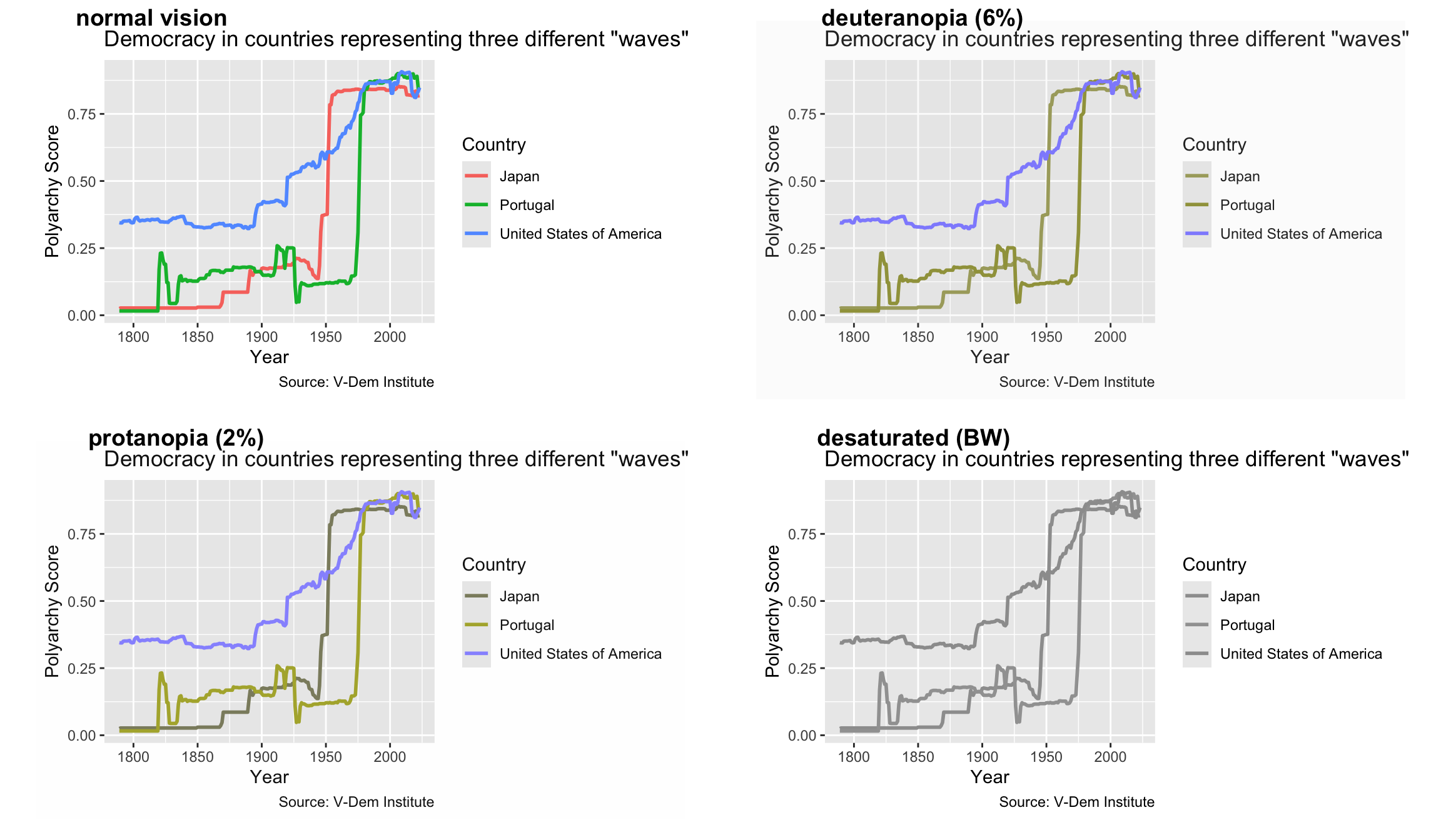
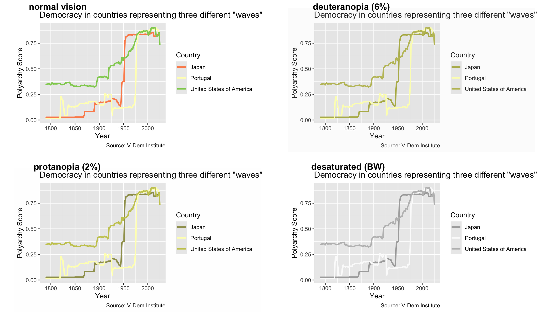
The problem with this plot is that people with red-green color blindness will not be able to distinguish between the lines for Japan and Portungal. There are many tools that we could use to see how this is true, but here we are going to focus on the color vision deficiency (CVD) simulator from the colorBlindness package. To use it, all we have to do is load colorBlindness and call cvdPlot() on the stored plot.
In this output, we can see how deuteranopia and protonopia (red-green color blindness) would experience our plot. Notice how hard it is to distinguish between Japan and Portugal here. We can also see how someone with monochromatic vision would see the plot by looking at the “desaturated (BW)” plot. While monochromatic vision is very rare, we can use this plot to make adjustments for a worst-case scenario.
So once you determine that your color scheme is not colorblind friendly, what should you do? There are two basic solutions available to you: making your own colorblind friendly color scheme or use a package that produces colorblind-friendly schemes for you.
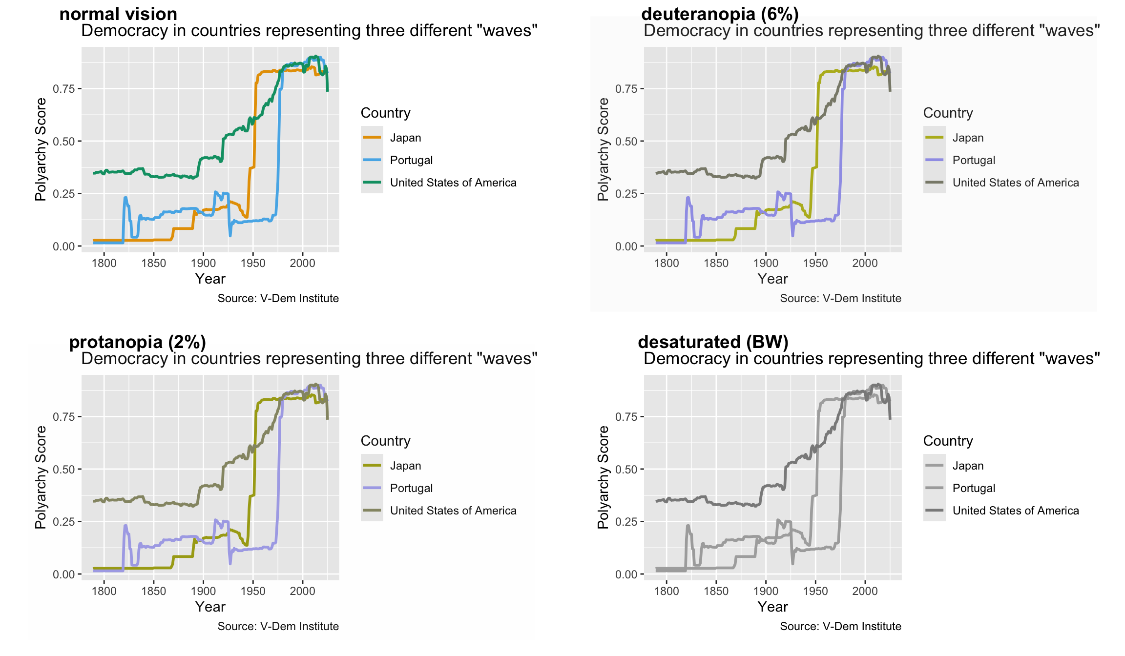
Let’s fix the line chart with the Okabe-Ito palette, a set of eight colors chosen specifically to stay distinguishable under color vision deficiency. First we create a vector of colors called cb_palette. Then we apply it to our lines with scale_color_manual(). We use scale_color_manual() rather than scale_fill_manual() because our chart is drawn with lines rather than filled shapes.
That is a big improvement. Japan and Portugal are now clearly distinct under both deuteranopia and protanopia, and they remain distinguishable in the desaturated (black and white) version as well.
Use viridis
Picking hex codes by hand gets tedious, so another option is to use a package designed with accessibility in mind. One of the more popular ones is the viridis package, whose scales come built into ggplot2. You have the option of choosing continuous, discrete or binned color schemes but here we use the discrete option scale_color_viridis_d() because our countries constitute a discrete variable. You can also try different viridis color maps by inserting the various available schemes in the function. For example you can get the “plasma” map with scale_color_viridis_d(option = "plasma"). The default map is “viridis.”
Note the end argument, which controls how far along the color map the scale runs. Because the top of the viridis scale is a pale yellow that can wash out against a white background, end = .8 is often a good idea for line charts.
Another package available to us is the RColorBrewer package. Technically, RColorBrewer is a separate package but its color mappings come available as part of ggplot2, so we don’t have to load RColorBrewer in order to use it with ggplot2. We can also use the ColorBrewer palette selector tool to help select palettes that are “colorblind safe.”
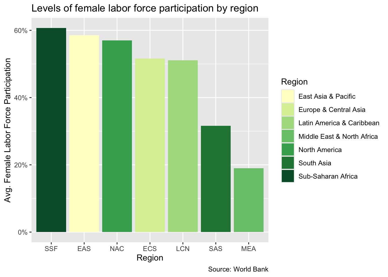
One thing to watch here is that ColorBrewer palettes come in three families: sequential (for ordered values that run low to high), diverging (for values around a meaningful midpoint), and qualitative (for unordered categories). Our three countries are unordered categories, so we want a qualitative palette like “Dark2”:
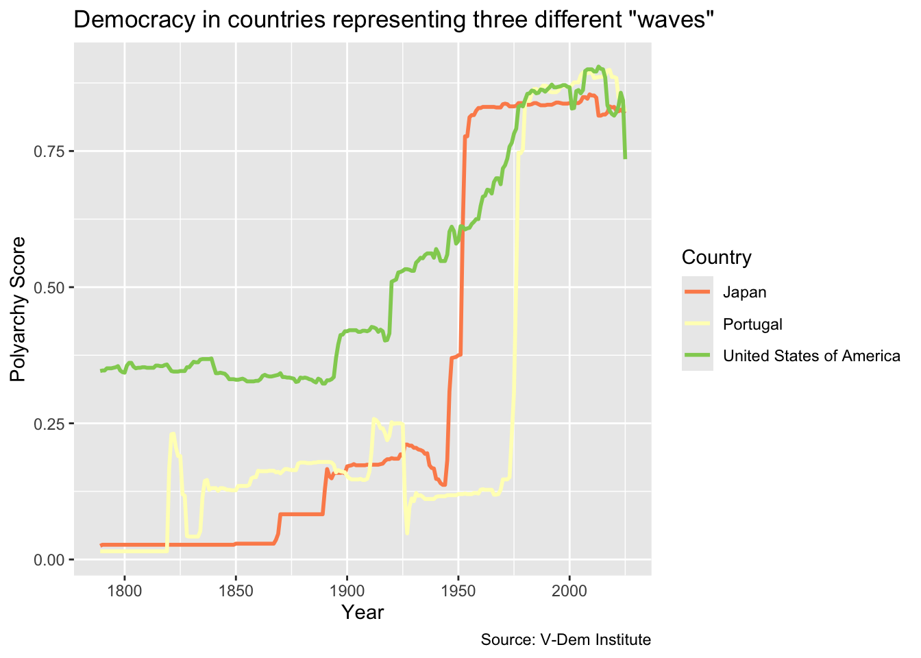
It is worth stressing that choosing a palette is not the same as choosing an accessible palette. Plenty of attractive palettes fail badly. Here is the same chart with a red-to-blue diverging palette:
Two of the three lines collapse into nearly the same color under red-green color blindness. The lesson is to make cvdPlot() a habit: apply a palette, then check it before you ship the chart.
Fill vs. color
One thing to note is that when we want to adjust the color scheme for a scatter plot or line chart, we use scale_color_* instead of scale_fill_*. The rule of thumb is:
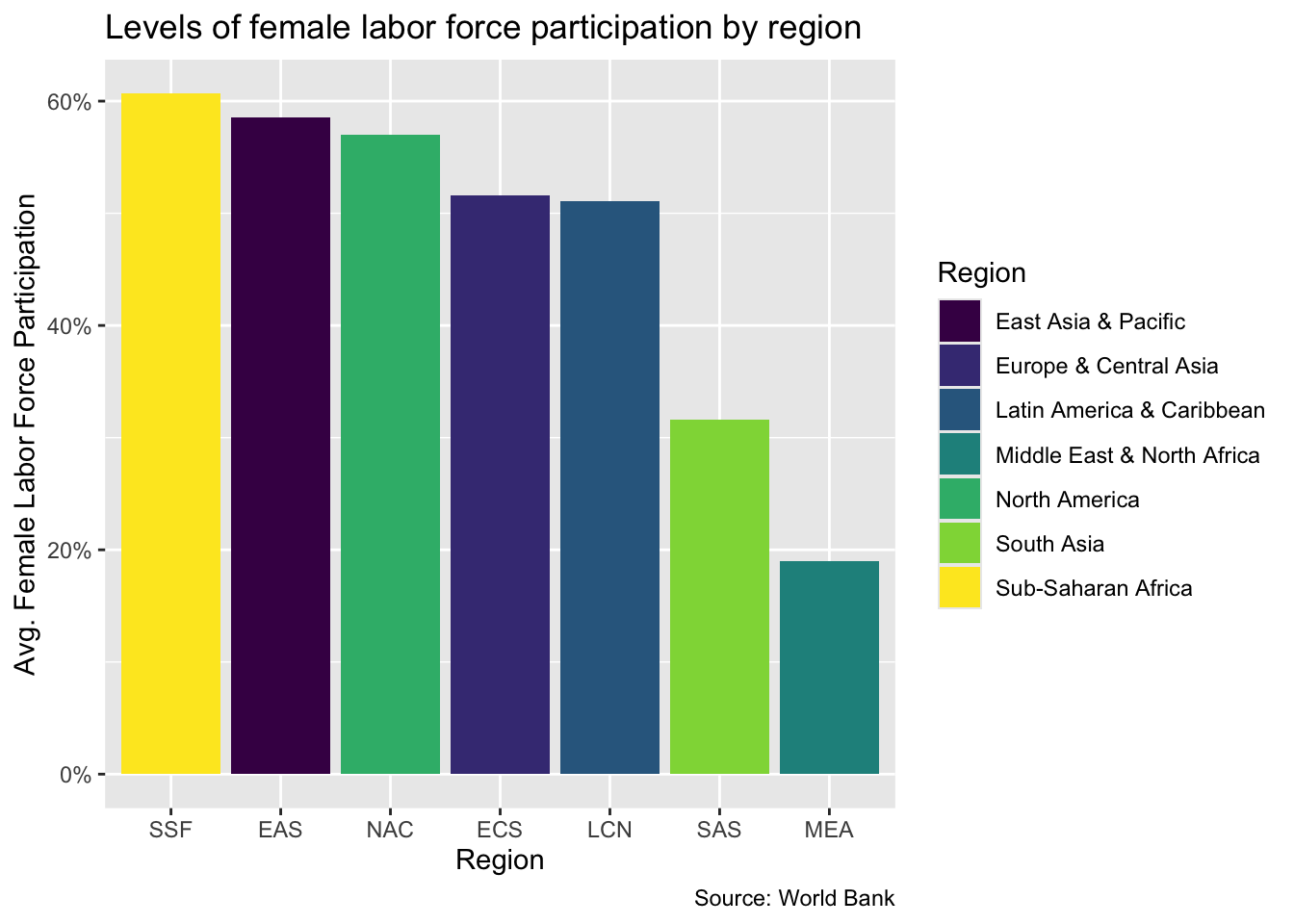
Use fill (fill =, scale_fill_*) for the inside of shapes: bar charts, column charts, box plots, histograms
Use color (color =, scale_color_*) for points, lines, and text: scatter plots, line charts, annotations
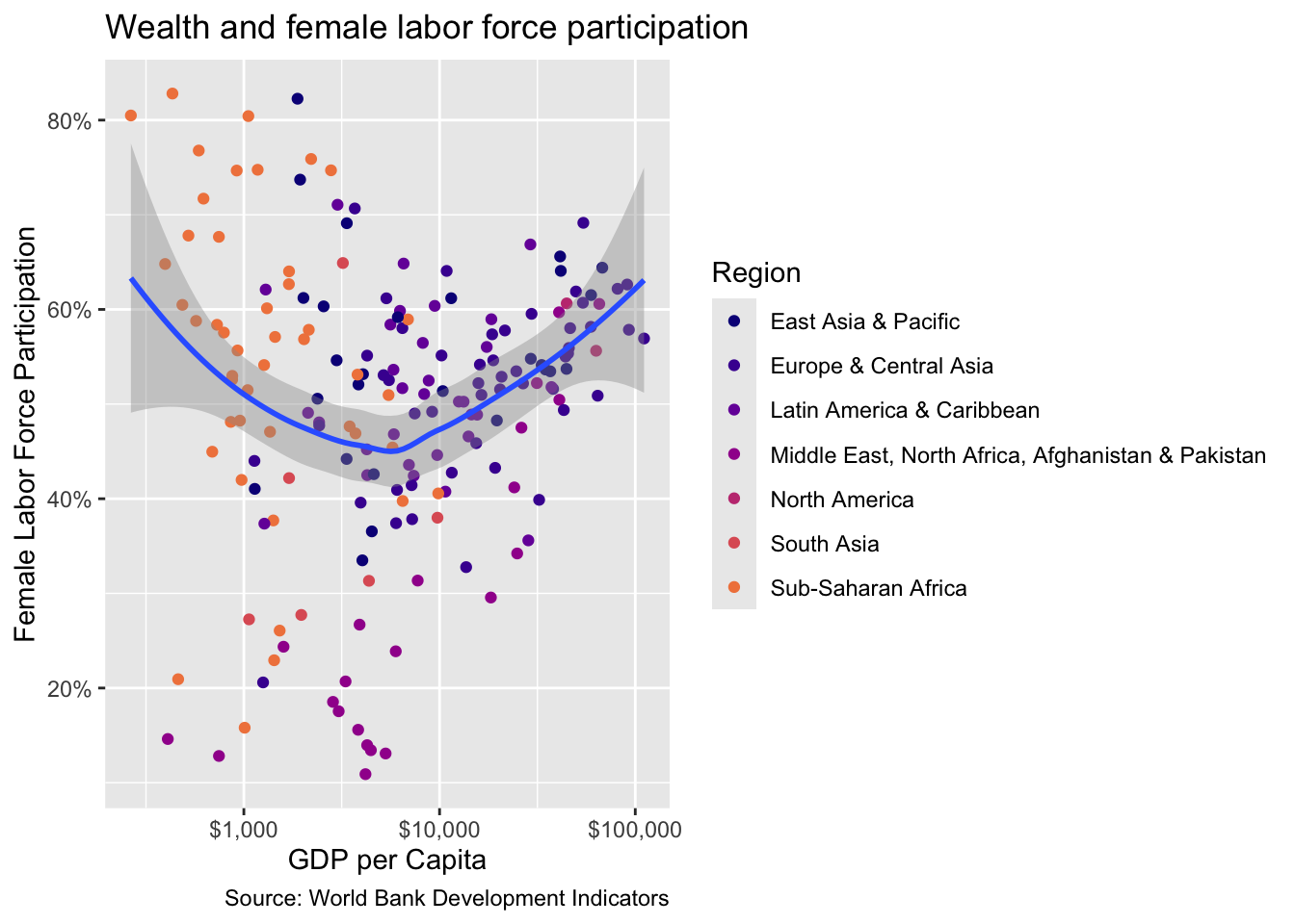
Every palette we have discussed has both versions, e.g. scale_fill_viridis_d() and scale_color_viridis_d(). Let’s try a viridis color map on a scatter plot. We will use the flfp_gdp data we prepped in the prework section.
wealth_flfp<-ggplot(flfp_gdp, aes(x =gdp_pc, y =flfp))+geom_point(aes(color =region))+# color points by regiongeom_smooth(method ="loess", linewidth =1)+# make the line a loess curvescale_x_log10(labels =scales::label_dollar())+# stretch axis, add '$' formatscale_y_continuous(labels =scales::label_percent(scale =1))+# add % labellabs( x="GDP per Capita", # x-axis title y ="Female Labor Force Participation", # y-axis title title ="Wealth and female labor force participation", # plot title caption ="Source: World Bank Development Indicators", # caption color ="Region"# legend title)wealth_flfp+scale_color_viridis_d(option ="plasma", end =.7)
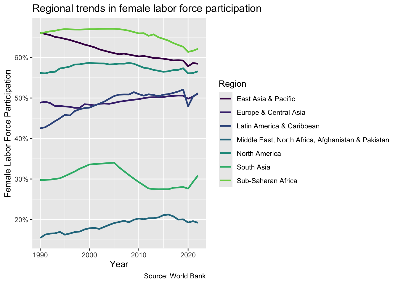
Now let’s try adding a ColorBrewer scheme to a different line chart. Here we will use the flfp_ts data frame that we prepped in our prework routine.
flfp_line<-ggplot(flfp_ts, aes(x =year, y =flfp, color =region))+geom_line(linewidth =1)+scale_y_continuous(labels =scales::label_percent(scale =1))+labs( x ="Year", y ="Female Labor Force Participation", title ="Regional trends in female labor force participation", caption ="Source: World Bank", color ="Region")flfp_line+scale_color_viridis_d(end =.8)
Themes
Another thing that we can do to improve the overall look of our plots is to change the theme. Here is a list of themes that are available with ggplot2.
There are also many extension packages that you can use to apply even more themes, some of which we may encounter later in the course.
For now, let’s take a couple of plots that we developed earlier in the lesson and apply some ggplot2 themes to them. We can do this by simply adding the name of the theme to our code.
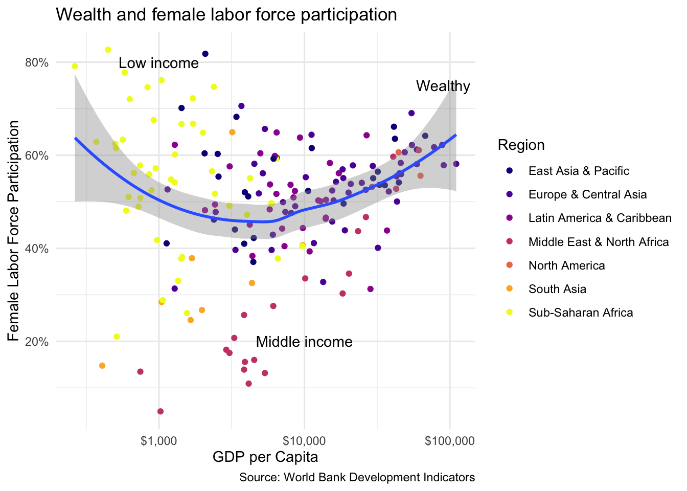
Sometimes it makes sense to include annotations in our charts. We can achieve this by applying the annotate() function. To add a text annotation, we include “text” for the first argument, then the value of x and y at which we want our annotation to appear, and finally the text of the annotation that we want to display. Let’s try adding text to our indicating where high-, middle- and low-income countries are concentraed on the wealth_flfp scatter plot that we developed earlier.
wealth_flfp<-wealth_flfp+scale_color_viridis_d(option ="plasma")+theme_minimal()wealth_flfp+annotate("text", x =90000, y =75, label ="Wealthy")+annotate("text", x =1000, y =80, label ="Low income")+annotate("text", x =10000, y =20, label ="Middle income")
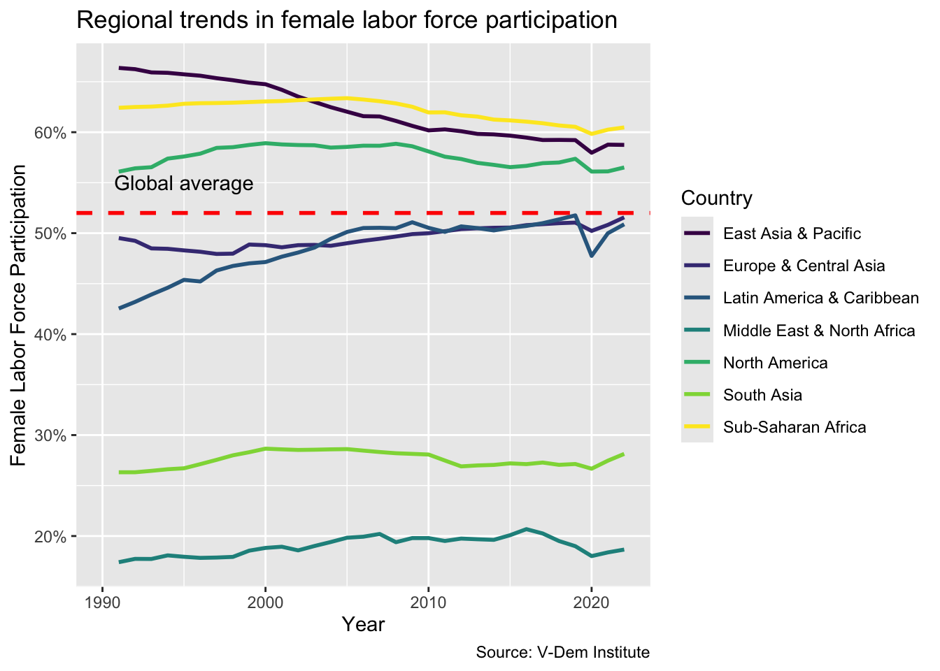
Another common annotation involves combining text with a horizontal or vertical reference line. For a horizontal intercept line we include an additional geom called geom_hline. The first argument is the value yintercept where we want the reference line to cross. Then we can add additional arguments to define the style, color and size of the line.
flfp_line<-flfp_line+scale_color_viridis_d()flfp_line+geom_hline(yintercept=52, linetype="dashed", color ="red", size =1)+annotate("text", x =1995, y =55, label ="Global average")
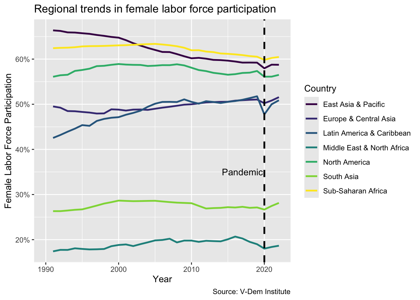
The same logic applies for a vertical reference line, except this time the geom is called geom_vline and the first argument, xintercept, is the point at which we want the line to cross the x-axis.
flfp_line<-flfp_line+scale_color_viridis_d()flfp_line+geom_vline(xintercept=2020, linetype ="dashed", size =1)+annotate("text", x =2017, y =35, label ="Pandemic")
Interactivity
One final thing we can do, which is really fun, is to add interactivity to our plots with plotly. We can do this by simply calling ggplotly() on our plot object.
In a lot of cases, we may want to control the tool tip of the plot. The tool tip is what appears when the user hovers over information on the chart. By default plotly shows every variable you have mapped, which is often more than you want. It is fairly simple to control. We just add the elements that we want to appear in a combine function, e.g. c(). In this case we will include region and female labor force participation in the tool tip.
Another thing we may want to do is to include some additional annotations. We might also notice that some of the things we include in the labs argument in ggplot2 do not get picked up by plotly and that we have to add them back with a layout(annotations = ) call. One additional idiosyncrasy is that any item that we want to include in the plotly chart has to be passed as an argument in the ggplot code. For example, we need to include aes(label = country) to view country in tool tip. But plotly does support the R native pipe operator and that makes it a little easier to layer on multiple annotations.
library(plotly)wealth_flfp_plotly<-wealth_flfp+scale_color_viridis_d(option ="plasma")+theme_minimal()+aes(label =country)# need so ggplot retains label for plotlyggplotly(wealth_flfp_plotly, tooltip =c("country", "flfp", "gdp_pc"))|>layout(annotations =list(text ="Source: World Bank Development Indicators", font =list(size =10), showarrow =FALSE, xref ='paper', x =1.1, xanchor ='right', xshift =0, yref ='paper', y =-.1, yanchor ='auto', yshift =0))|># add web addresslayout(annotations =list(text ="www.dataviz-gwu.rocks", font =list(size =10, color ='grey'), showarrow =FALSE, xref ='paper', x =.5, xanchor ='center', xshift =0, yref ='paper', y =1, yanchor ='top', yshift =0))
Notice that plotly has some fairly unique syntax for the layout() function. It helps to read the documentation but also to search around on google and Stack Overflow. Each annotation needs to be inputted in a list format. The first time in the list is the text you want to include in the annotation. From there you can include multiple arguments to specify the font size and location of the annotation.
-1.png)
-1.png)