Three DataViz Examples
Maps, Democracy Trends, and UN Voting
September 14, 2026
Plan for Today
- Go over three visualization examples on Posit Cloud
- Make a map
- Plot democracy over time
- Plot UN voting trends
Let’s get going . . .
Let’s open up the Getting Started module on Posit Cloud…
And work through the examples there.
Example: Make a Map!
Example: Make a map!
Example: Plotting Democracy Over Time
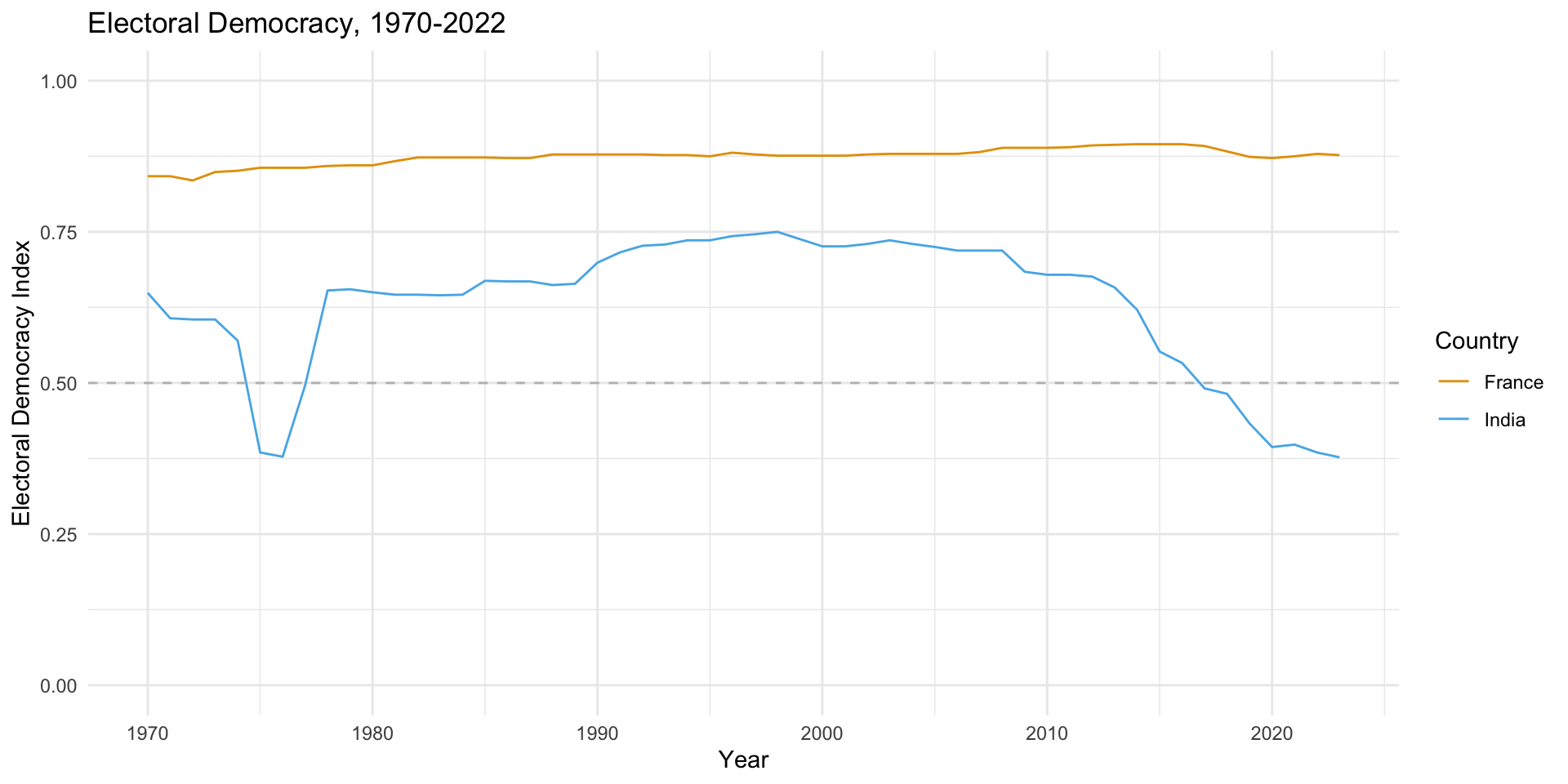
Example: Plotting Democracy Over Time
# Load the packages
library(vdemlite)
library(ggplot2)

# Use vdemlite to extract democracy scores for France and INdia
dem_data <- fetchdem(indicators = "v2x_polyarchy",
                     countries = c("FRA", "IND"))

# And now we can plot the data
ggplot(dem_data, aes(y = v2x_polyarchy, x = year, color=country_name)) +
  geom_line() +
  theme_minimal() +
  xlab("Year") +
  ylab("Electoral Democracy Index") +
  ggtitle("Electoral Democracy, 1970-2022") +
  geom_hline(yintercept = .5, linetype = "dashed", color = "grey") +
   scale_color_manual(name="Country", values=c("#E69F00", "#56B4E9")) +
  ylim(0, 1)
Example: UN Voting Trends
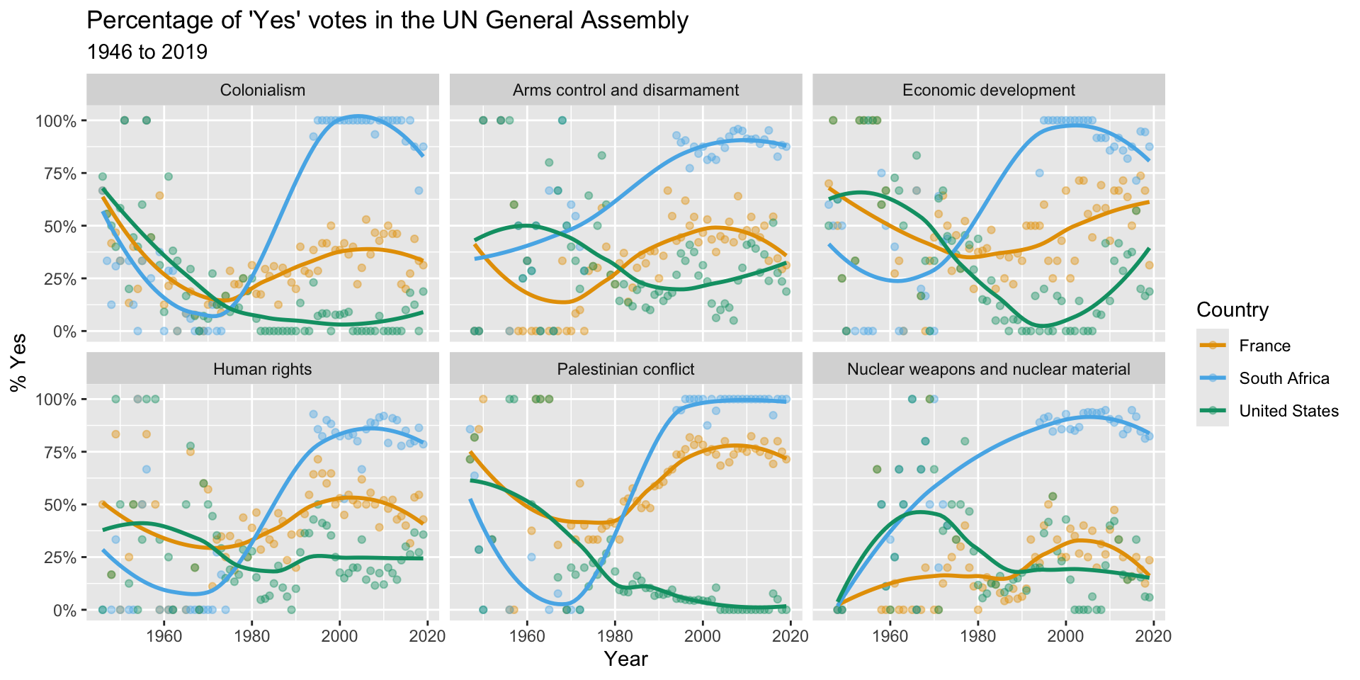
Example: UN Voting Trends
library(tidyverse)
library(unvotes)
library(lubridate)
library(scales)
library(pacman)

unvotes <- un_votes %>%
  inner_join(un_roll_calls, by = "rcid") %>%
  inner_join(un_roll_call_issues, by = "rcid")

unvotes %>%
  # then filter out to only include the countries we want
  filter(country %in% c("South Africa", "United States", "France")) %>%
  # then make sure R understands the the year variable is a data
  mutate(year = year(date)) %>%
  # Then group the data by country and year
  group_by(country, year, issue) %>%
  # then take the average Yes votes for each country_year
  summarize(percent_yes = mean(vote == "yes")) %>%
  # then make a nice plot
  ggplot(mapping = aes(x = year, y = percent_yes, color = country)) +
  geom_point(alpha = 0.4) +
  geom_smooth(method = "loess", se = FALSE) +
  facet_wrap(~issue) +
  scale_y_continuous(labels = percent) +
  scale_color_manual( values=c("#E69F00", "#56B4E9", "#009E73")) +
  labs(
    title = "Percentage of 'Yes' votes in the UN General Assembly",
    subtitle = "1946 to 2019",
    y = "% Yes",
    x = "Year",
    color = "Country"
  )