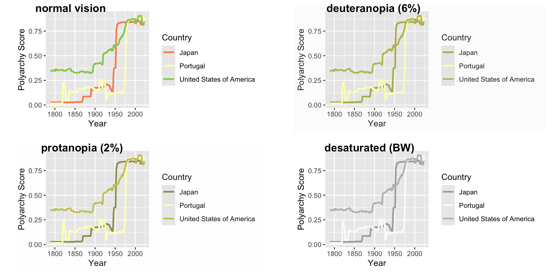
Color Vision Deficiency (CVD) or color blindness affects 8 percent of men and 1 in 200 women
There are different types of CVD but most common is red-green color blindness
Therefore, don’t include red and green in the same chart!
Look for color blind safe palettes
Color Should Carry Information
Color is a third dimension of your data, not decoration
If your x-axis already shows the categories, coloring by that same variable adds nothing
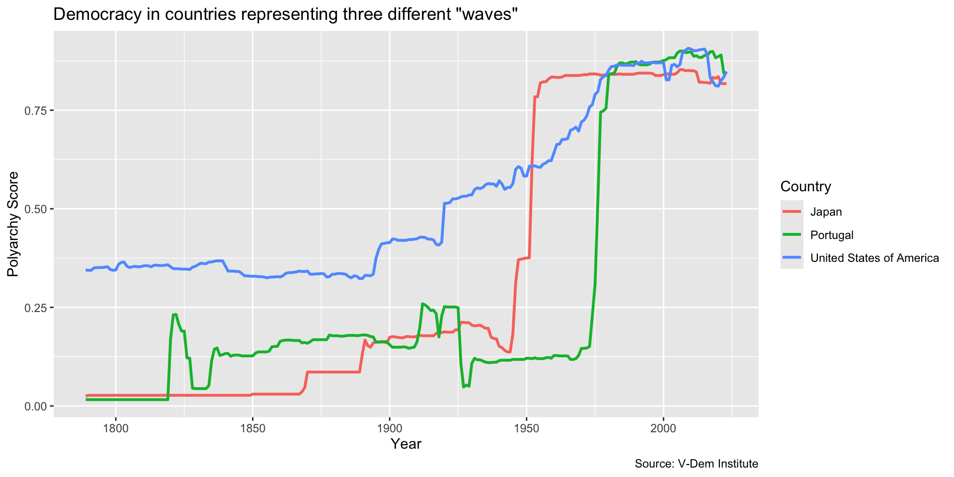
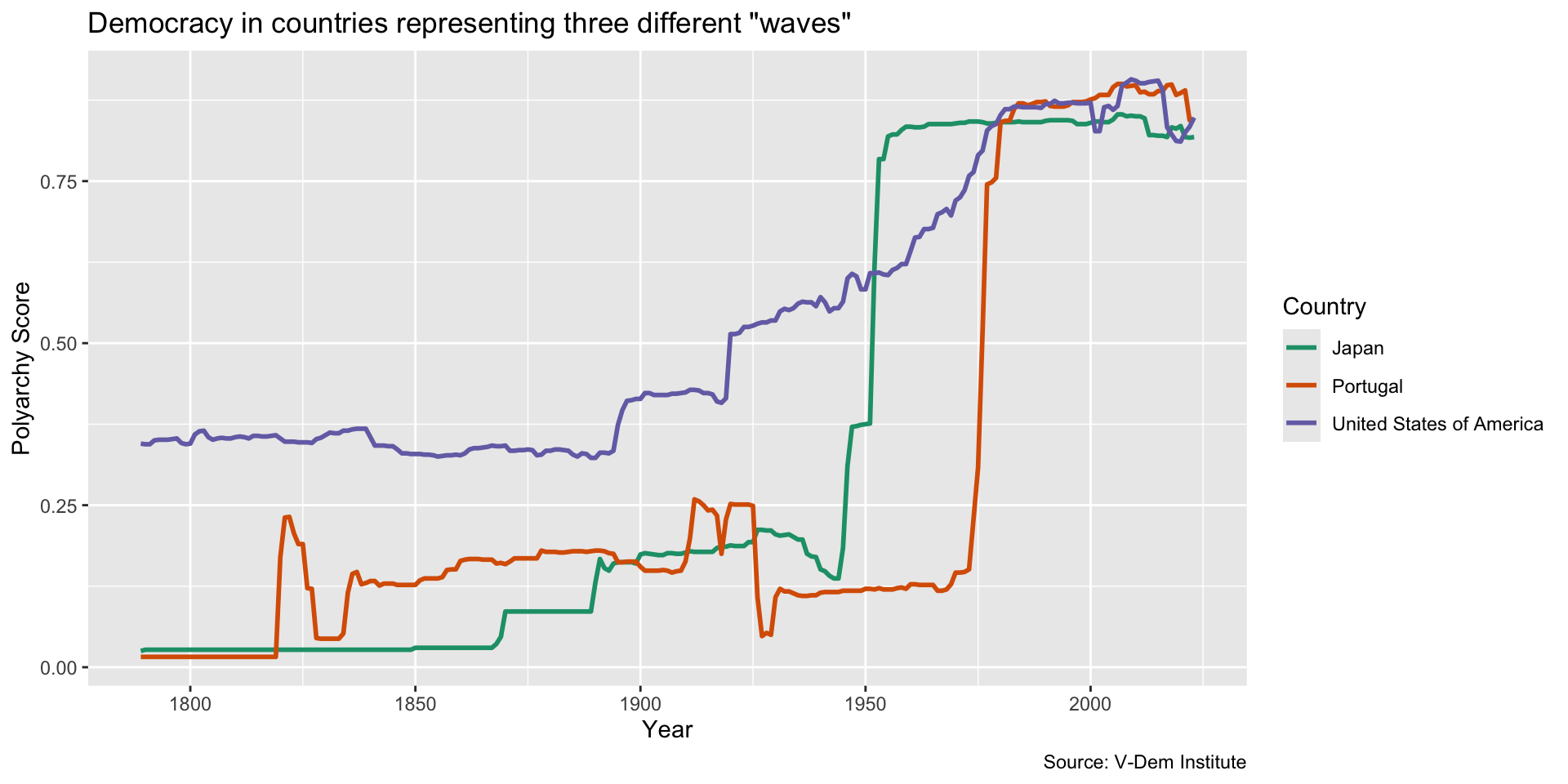
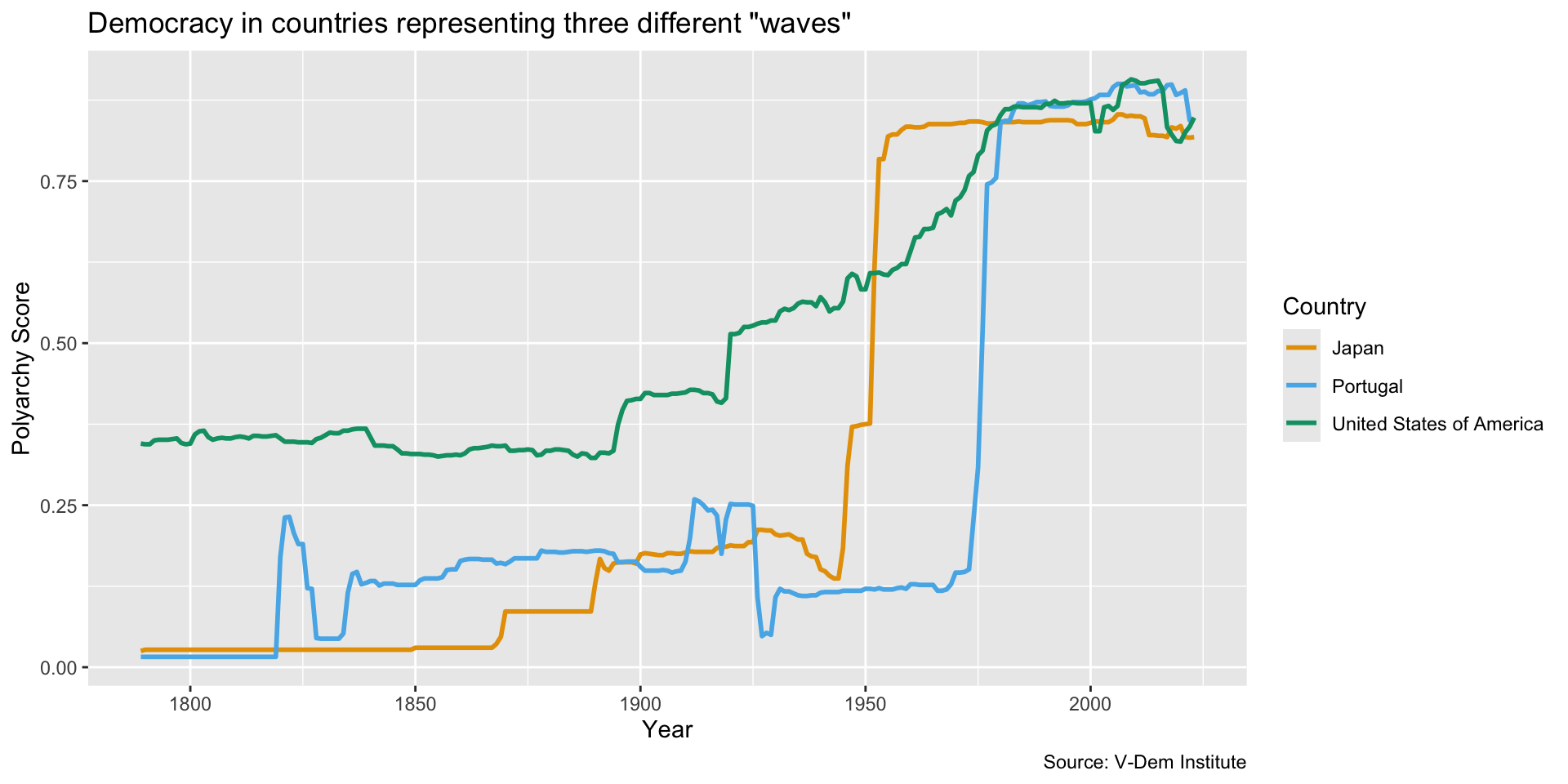
In the line chart below, color is doing real work–it is the only thing telling the three countries apart
That is exactly why the color scheme has to be readable for everyone
Last Week’s Line Chart
Last Week’s Line Chart
Create last week’s line chart and save it as an object…
dem_waves_ctrs <-read_csv("data/dem_waves_ctrs.csv")dem_waves_chart <-ggplot(dem_waves_ctrs, aes(x = year, y = polyarchy, color = country)) +geom_line(linewidth =1) +# our geom is a line with a width of 1labs(x ="Year",y ="Polyarchy Score",title ='Democracy in countries representing three different "waves"',caption ="Source: V-Dem Institute",color ="Country"# make title of legend to upper case )
Checking Your Colors
Checking Your Colors
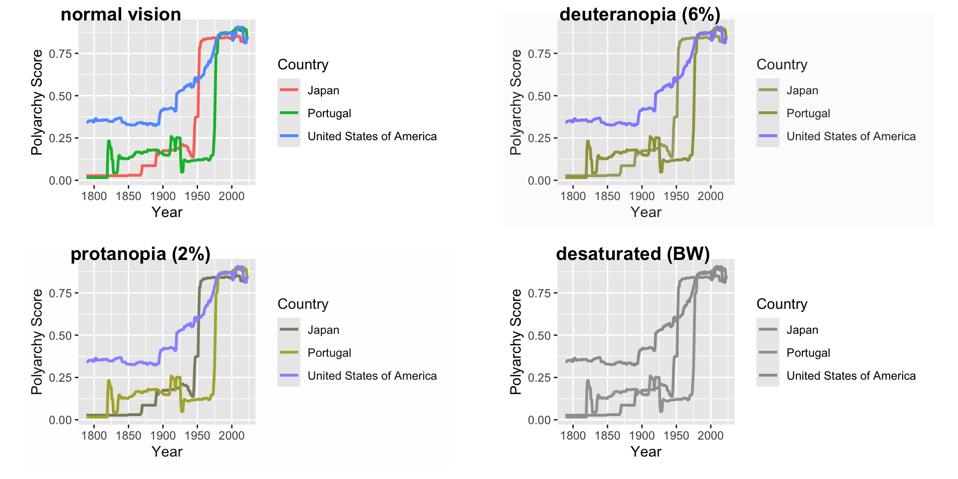
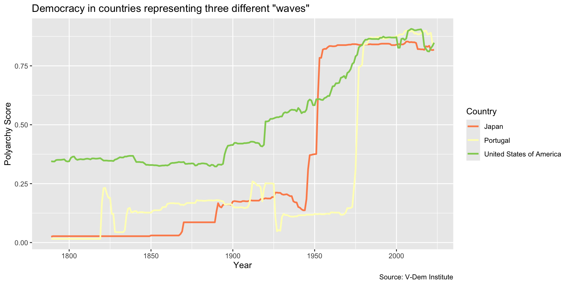
Call cvdPlot() from the colorBlindness package. CVD stands for “color vision deficiency.”
library(colorBlindness)cvdPlot(dem_waves_chart)
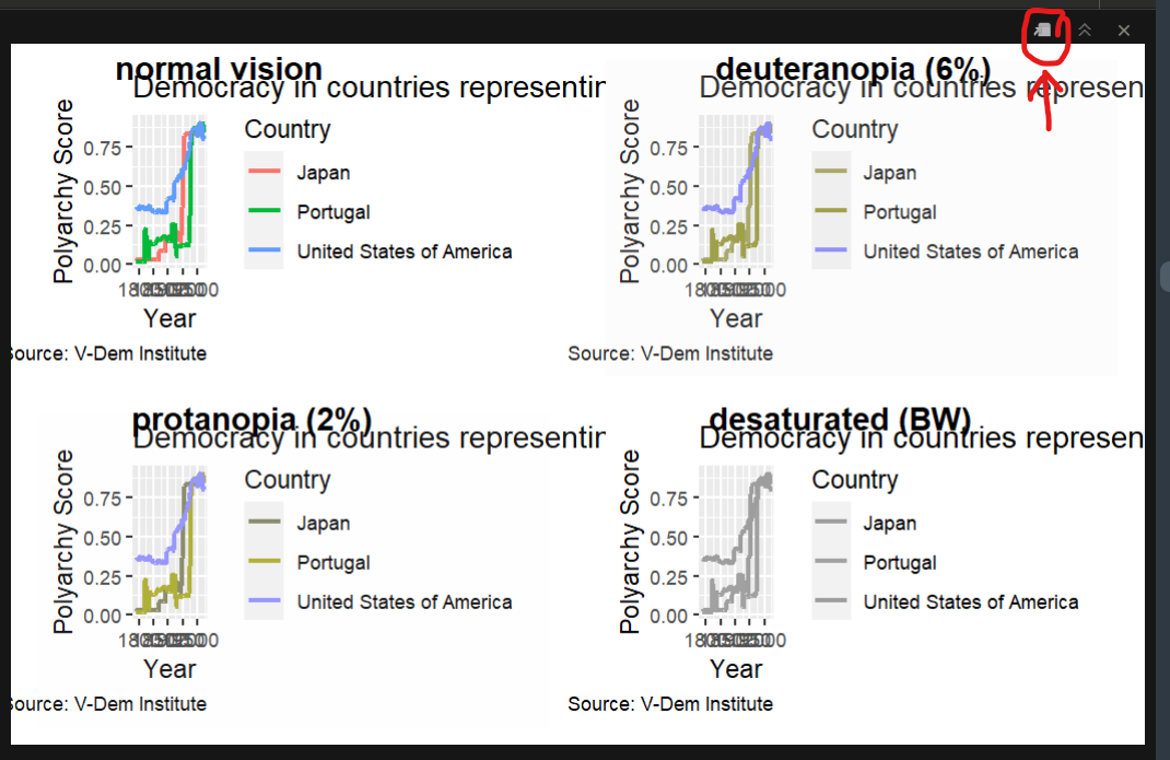
Click on the little image in the plot pane to expand your view…
Your Turn!
Take your dem_waves_chart object and run cvdPlot() on it
Expand the window and have a good look
Which group would have the toughest time reading this graph?
Colorblind-Safe Palettes
Three ready-made options. All work the same way–add a scale_color_* (or scale_fill_*) to your plot:
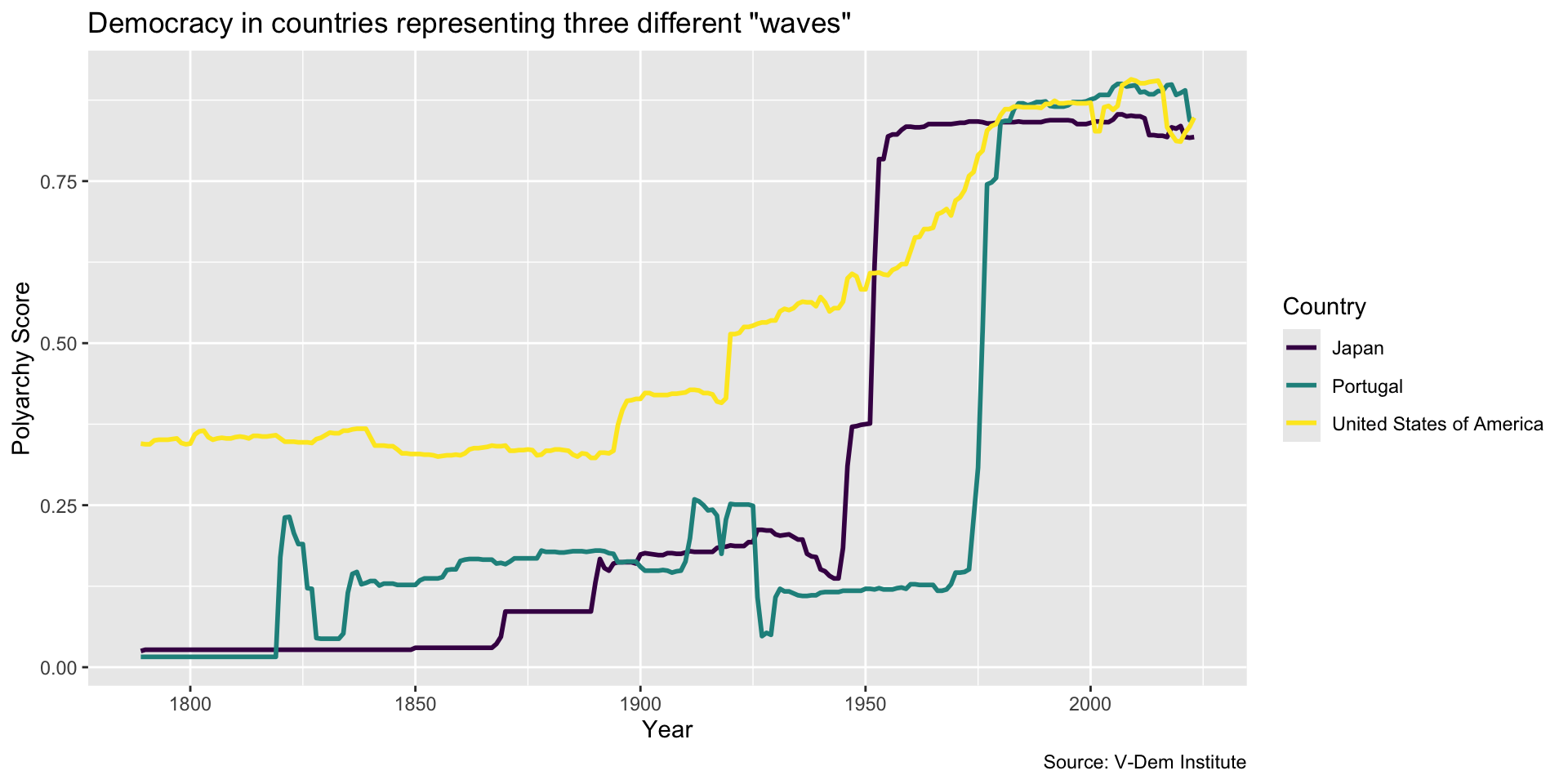
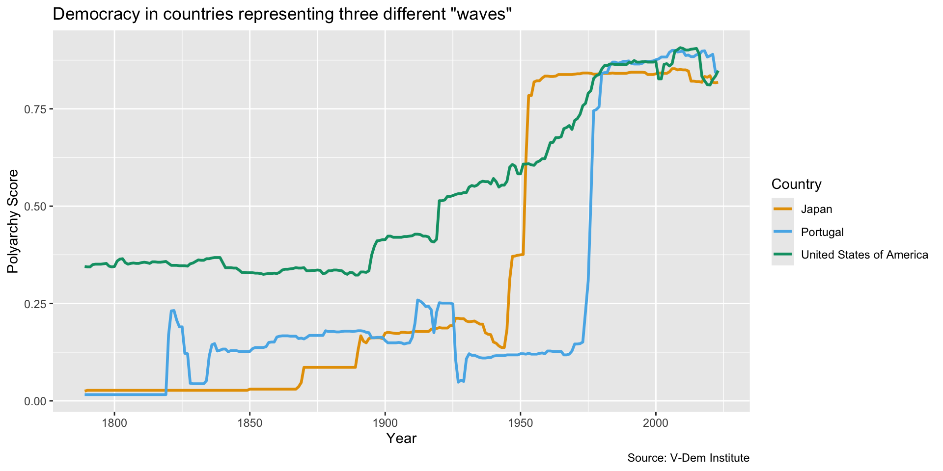
Viridis – built into ggplot2, works for discrete and continuous data, and stays readable in grayscale
ColorBrewer – also built in, but only some of its palettes are safe; use the selector tool and check the “colorblind safe” box
paletteer – thousands of palettes through one function, including the classic Okabe-Ito set
Viridis
dem_waves_chart +scale_color_viridis_d()
ColorBrewer
Our countries are unordered categories, so we want a qualitative palette. Dark2 is the one that holds up best under CVD.
Use fill (fill = or scale_fill_*) for the inside of shapes:
Bar charts, box plots, histograms
Use color (color = or scale_color_*) for points, lines, and text:
Scatter plots, line charts, text elements
Every palette we just saw has both versions, e.g. scale_fill_viridis_d() and scale_color_viridis_d().
Scaling for Scatter Plots
Scaling for Scatter Plots
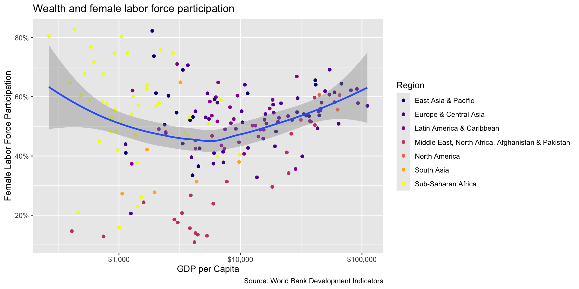
wealth_flfp <-ggplot(flfp_gdp, aes(x = gdp_pc, y = flfp)) +geom_point(aes(color = region)) +# color points by regiongeom_smooth(method ="loess", linewidth =1) +# make the line a loess curvescale_x_log10(labels = scales::label_dollar()) +# stretch axis, add '$' formatscale_y_continuous(labels = scales::label_percent(scale =1)) +# add % labellabs(x="GDP per Capita", # x-axis titley ="Female Labor Force Participation", # y-axis titletitle ="Wealth and female labor force participation", # plot titlecaption ="Source: World Bank Development Indicators", # captioncolor ="Region"# legend title )wealth_flfp +scale_color_viridis_d(option ="plasma")
Tuning the Scale
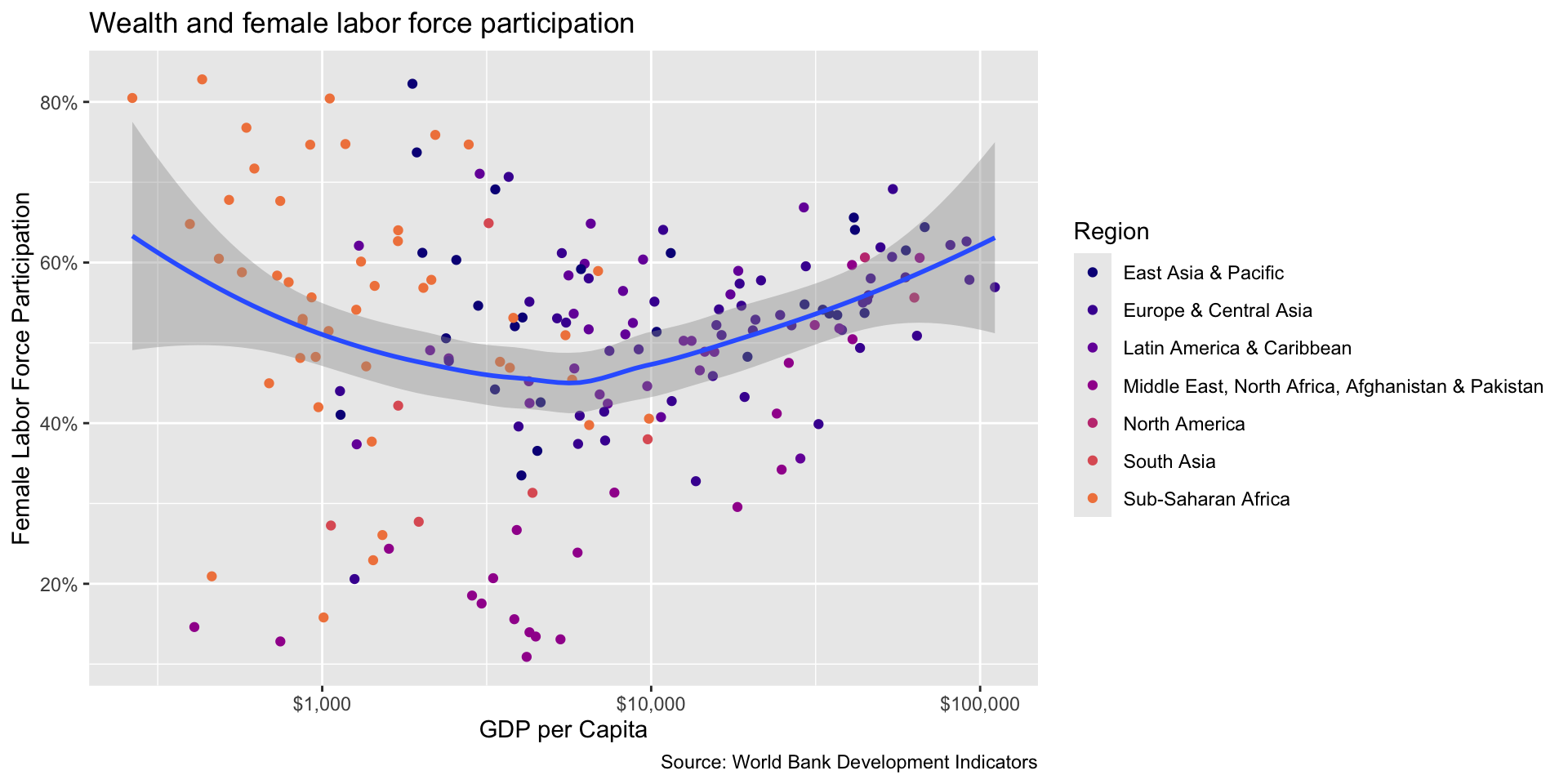
Use end to darken the colors. direction = -1 flips the scale.
wealth_flfp +scale_color_viridis_d(option ="plasma", end = .7)
Your Turn!
Try using one of the color schemes on the scatter plot
Use scale_color_ instead of scale_fill_
Play around with the end and direction arguments in viridis