Themes, Annotations and Interactivity
September 17, 2026
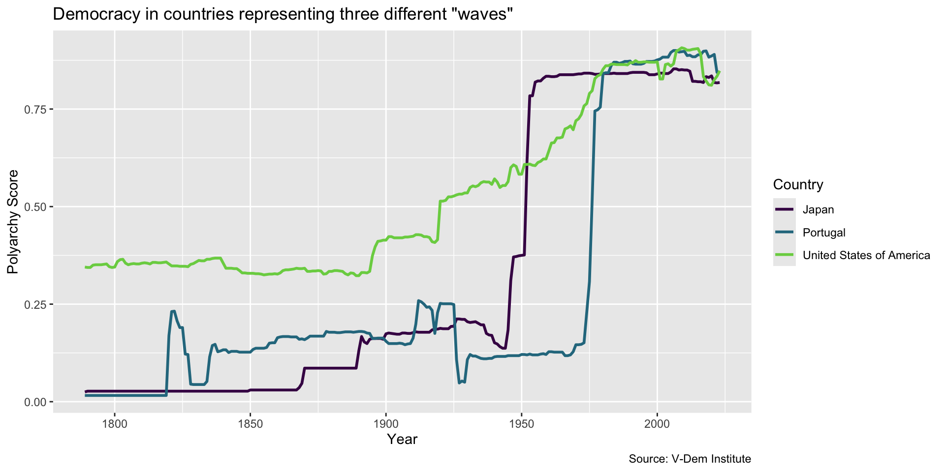
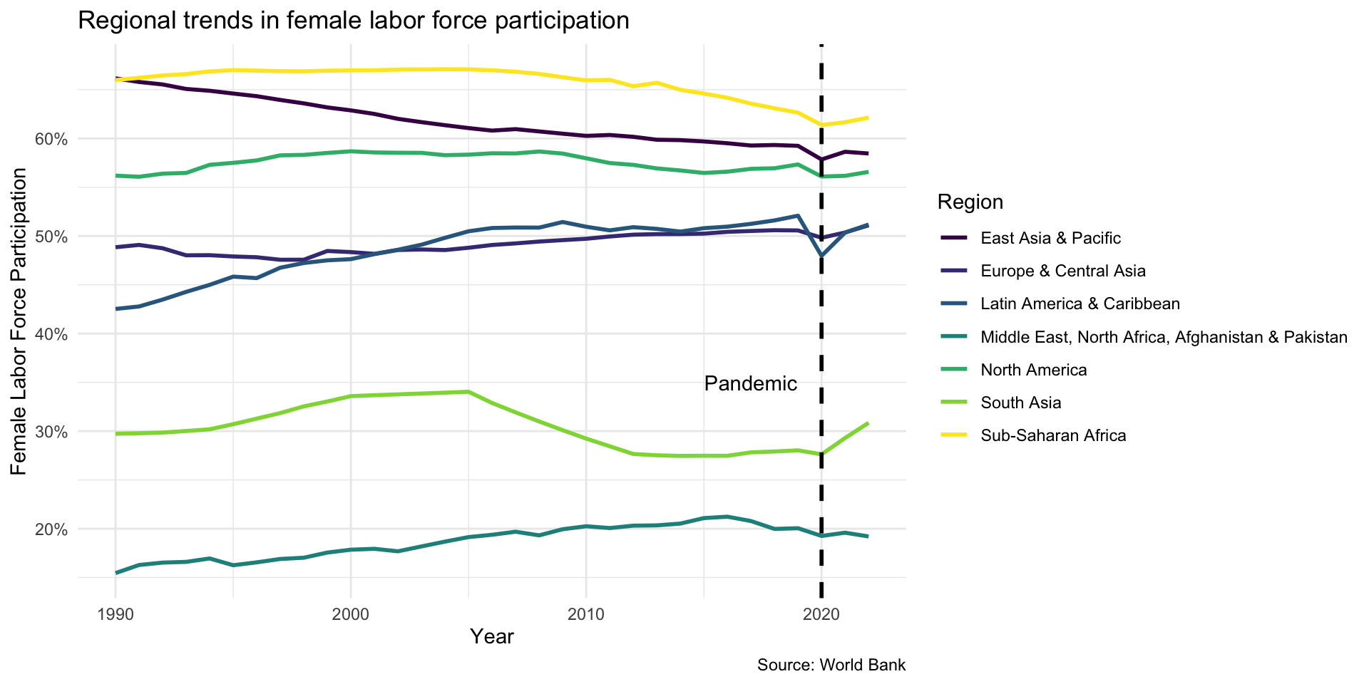
Line Chart from Last Class
![]()
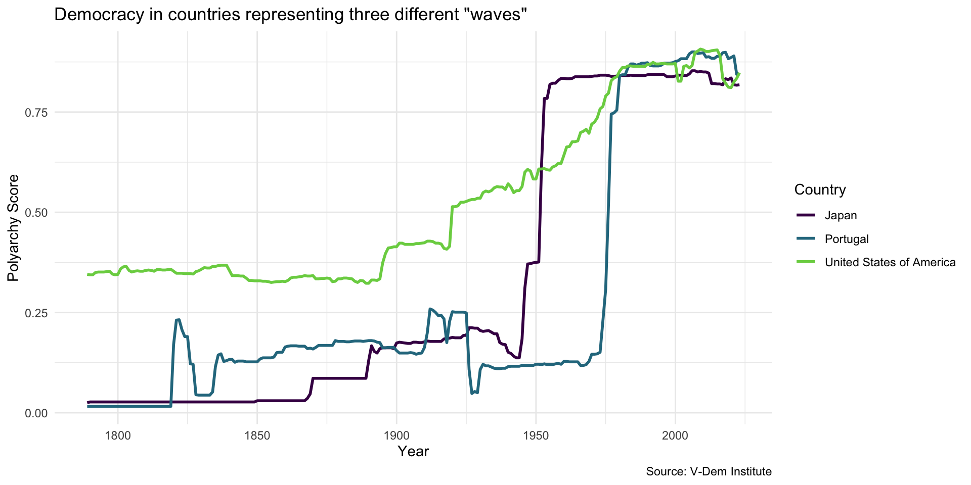
Add a Theme
Code
dem_waves_chart + theme_minimal()
![]()
Can Also Set Theme
If you like particular theme and want to use it for all of your visualizations, use theme_set() in a code chunk at the top of your document, e.g….
```{r}
#| label: my_setup_chunk

theme_set(theme_minimal())
```
… and R will apply that theme to all of the visualizations in your document.
Your Turn!
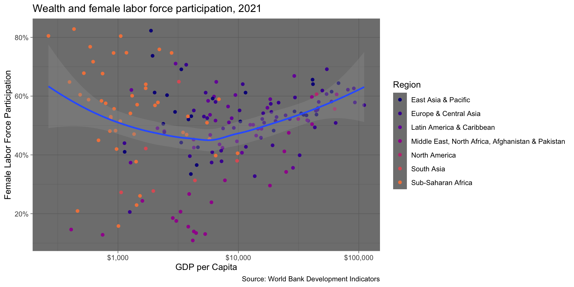
Produce this scatter plot… Then try different themes.
![]()
Add an Annotation
![]()
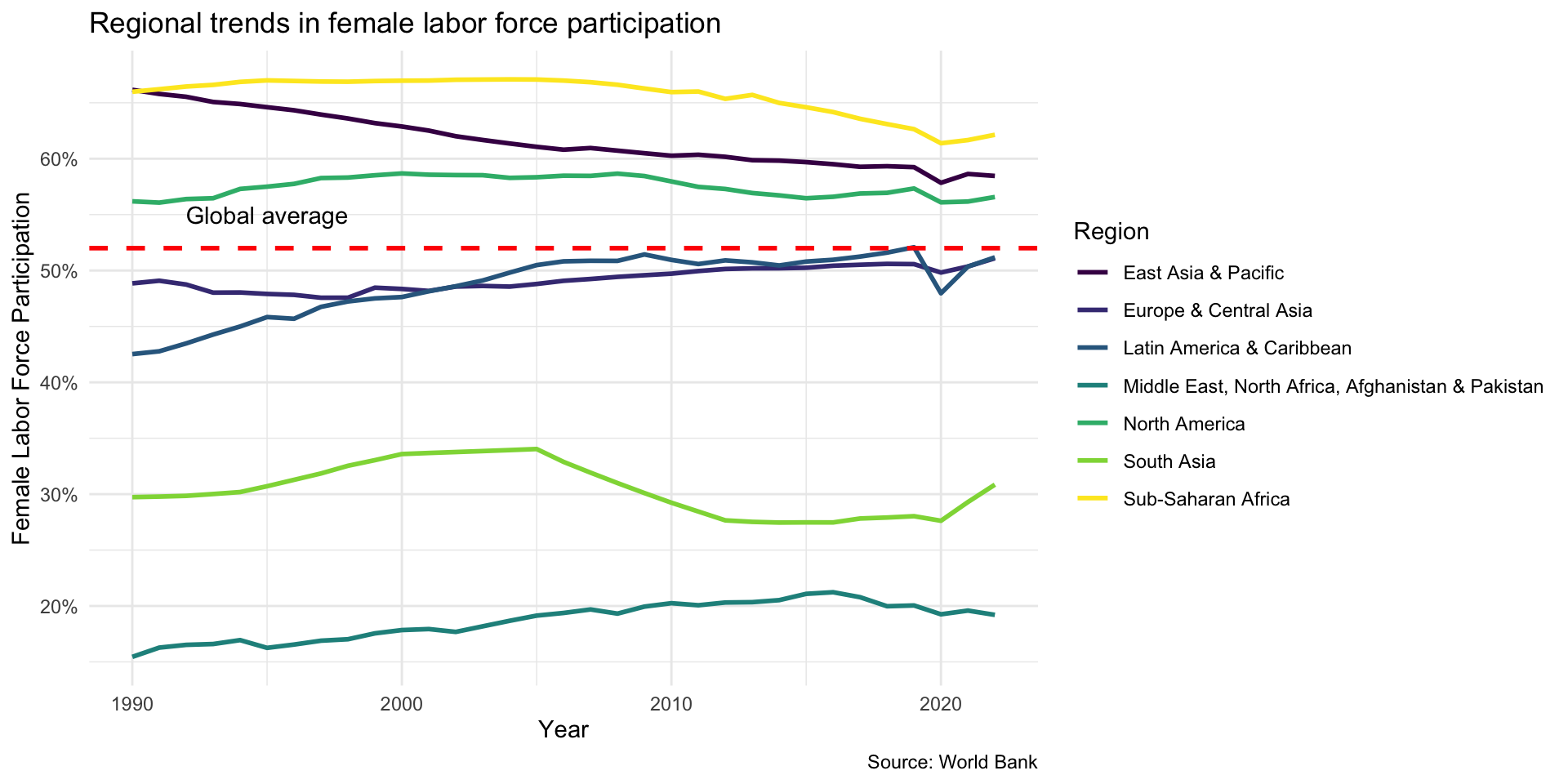
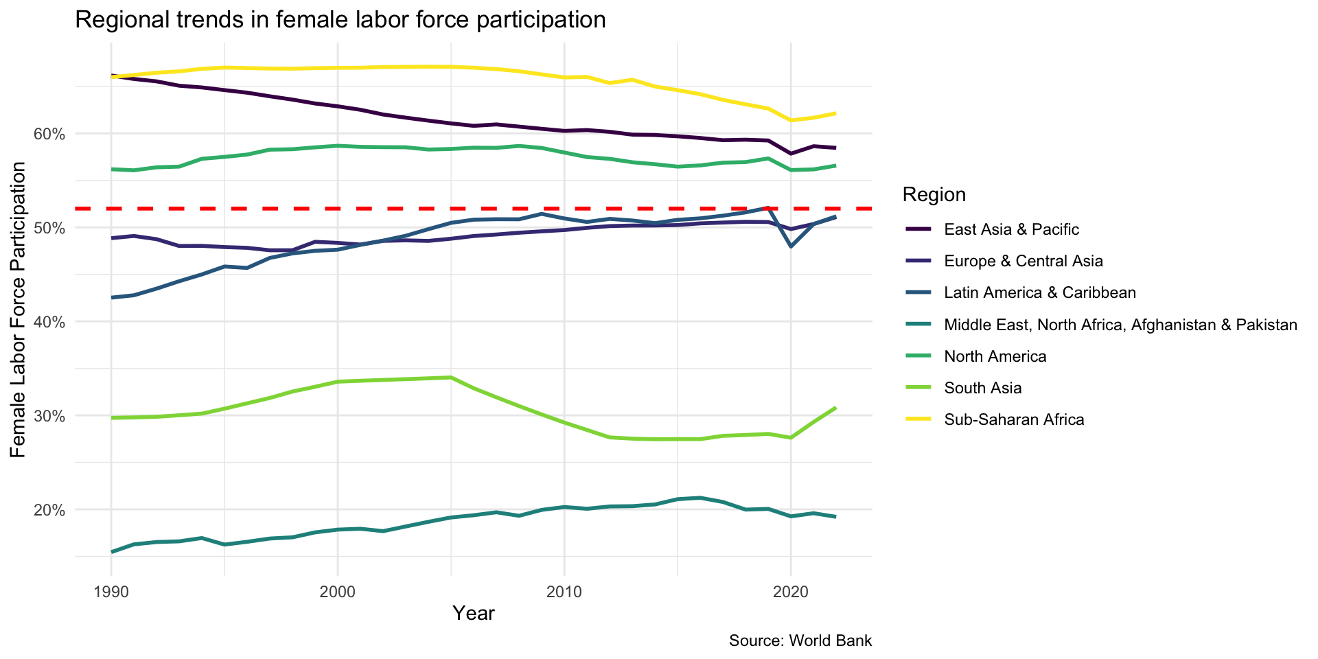
First step, add a horizontal line using geom_hline()…
Code
flfp_line +
  geom_hline(yintercept = 52, linetype = "dashed", color = "red", linewidth = 1)
![]()
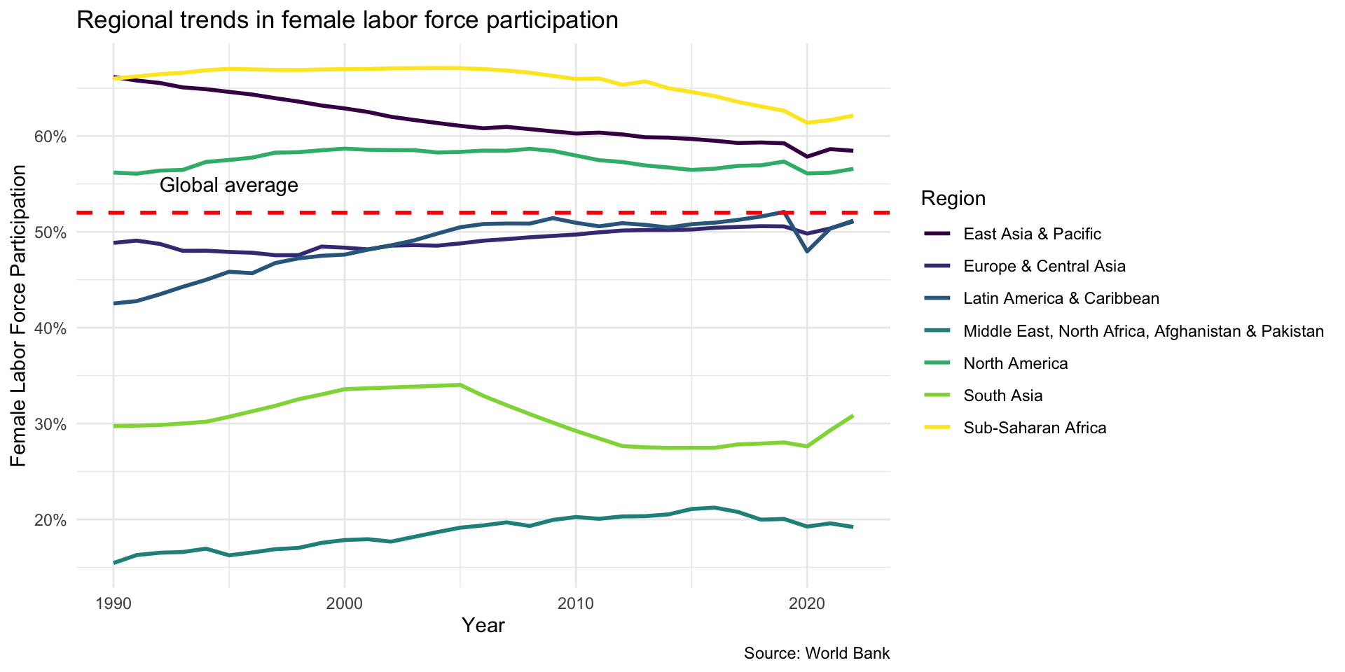
Second step, the annotation with annotate()…
Code
flfp_line +
  geom_hline(yintercept = 52, linetype = "dashed", color = "red", linewidth = 1) +
  annotate("text", x = 1995, y = 55, label = "Global average")
![]()
Vertical Reference Line
![]()
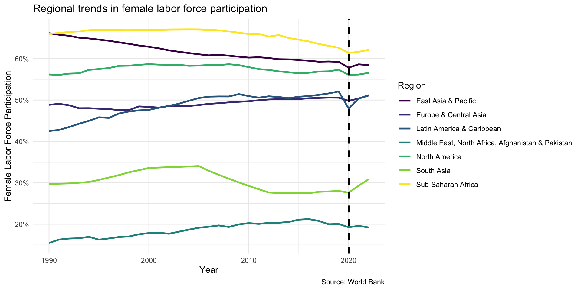
First step, add a horizontal line using geom_hline()…
Code
flfp_line +
  geom_vline(xintercept=2020, linetype = "dashed", linewidth = 1)
![]()
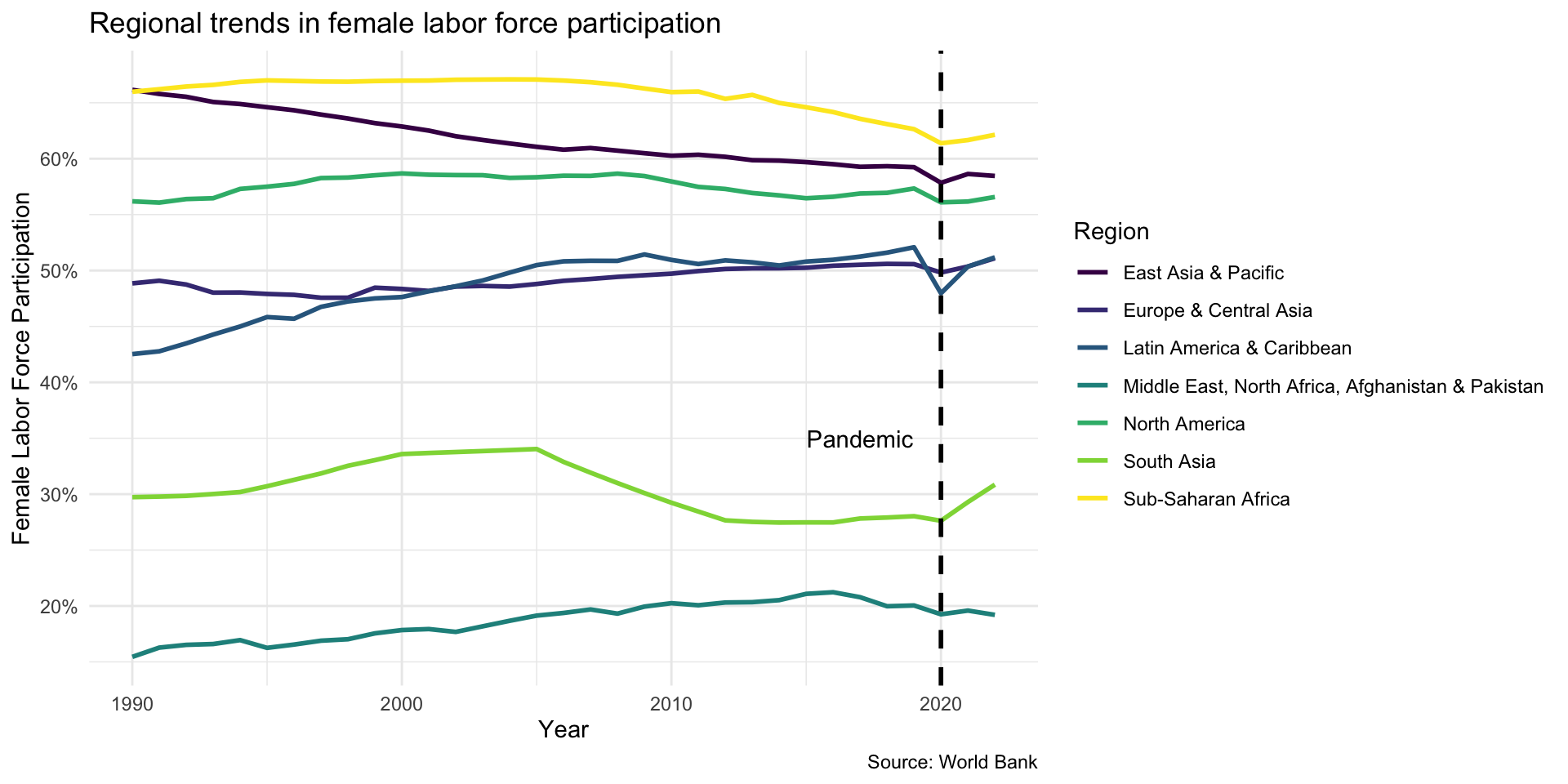
Second step, add the annotation with annotate()
Code
flfp_line +
  geom_vline(xintercept=2020, linetype = "dashed", linewidth = 1) +
  annotate("text", x = 2017, y = 35, label = "Pandemic")
![]()
Your Turn!
- Go to module 2.2
- Copy the code you need to make the line chart
- Create a horizontal reference line and annotate it
- In a new code chunk, create a vertical line and annotate it
- Play with the parameters to move and style your line
- Try different text, etc.
Interactivity
Any ggplot can become an interactive chart with one function: ggplotly() from the plotly package.
library(plotly)

ggplotly(wealth_flfp_plotly)
Your Turn!
- Go to module 2.2 and create the basic wealth vs. flfp scatter plot
- Now “plotlify” it by wrapping it in
ggplotly()
- Hover over the points to see the default tooltip
- Now use
tooltip = to choose which variables appear
- Try adding
aes(label = country) so you can show the country name
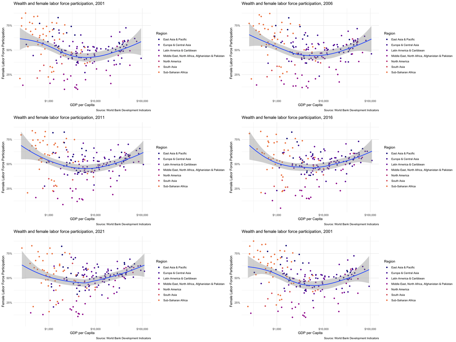
Animated Plots
![]()
Animated Plots
Two additions: transition_states() picks the variable to animate over, and {closest_state} puts it in the title.
library(gganimate)

flfp_gdp_ts <- wb_data(indicators, mrv = 25) |> # 25 most recent years
    left_join(select(wb_countries(), c(iso3c, region)), by = "iso3c") |>
    drop_na() |> rename(year = date)

ggplot(flfp_gdp_ts, aes(x = gdp_pc, y = flfp)) +
  geom_point(aes(color = region)) +
  scale_x_log10(labels = scales::label_dollar()) +
  scale_y_continuous(labels = scales::label_percent(scale = 1)) +
  transition_states(year) +
  labs(title = "Wealth and female labor force participation, {closest_state}") +
  scale_color_viridis_d(option = "plasma", end = .7)
Your Turn!
- Try making an animated scatter plot with different a different y-axis variable
- See if you can make the title change based on the year displayed